Kashida justification
Arabic is written joined-up. When a line of it is justified, the stretch
belongs inside the words -- the pen stroke between two letters gets
longer -- not in the spaces between them. That stretch is called the
kashida. Browsers don't do it: they widen the word gaps, which is
how Latin justifies, and it looks wrong in Arabic. This patch teaches Chrome
to do it, behind a flag, via text-justify: kashida -- and a
second property, text-kashida-space, dials how the leftover
space is split between strokes and word gaps.
See it
Rendered live by the browser you are reading this in. It doesn't know
kashida, so the extra space goes into the word gaps.
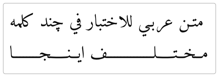
Screenshot of the patched build. Same text, same width: the lines fill out by lengthening the strokes inside the words.
How it works
When a justified line comes up short, Blink picks one stretch point per
word, slips tatweel characters (U+0640, the "long stroke"
character) into the text that goes to the font, and shapes it again. The
font draws the elongation. The page's actual text never changes, so
selecting, searching and copying behave exactly as before.
Where the stretch goes
Each word stretches at one spot -- calligraphers elongate a word once, not at every join. The spot is chosen by the connection priority scheme IE6 documented and Word/InDesign follow:
- a tatweel the author already wrote (poetry does this) wins outright;
- then the flat tail of a seen or sad;
- then the join before the word's final letter, better letters first (heh-likes, then alef/lam/kaf-likes, then waw/ain/qaf/feh-likes, then anything else that connects);
- ties go to the spot nearest the word's end;
- and as a last resort, a join before a medial letter -- so a word like hilal, whose only free join precedes its lam-alef ligature, still stretches (as IE and DirectWrite do) with the ligature kept whole.
Which letter pairs may stretch at all comes from Unicode's joining data -- the same tables the shaper uses -- not from a hand-made letter list. That's why digits and punctuation are never stretched, vowel marks don't get in the way, and Persian and Urdu work out of the box.
What is never touched
- Ligatures that must stay whole: lam-alef, and the lam-lam-heh of the word Allah, whose ligature carries its own marks. A word with no stretch point at all is left alone entirely.
- Fonts that can't take the stretch. Nastaliq faces compose words as sloped calligraphic units that a baseline tatweel tears apart; the shaper is asked (HarfBuzz safe-to-insert-tatweel flags) whether the font has any provably safe insertion point, and if it has none the font is skipped.
- Ruby annotations and SVG text, which can't stretch letters -- they keep normal spacing instead of tearing words apart.
When spaces take over
Whatever the stretch can't absorb -- and lines with nothing to stretch at all (Latin text, digits, words of non-joining letters, a skipped font) -- falls back to normal word spacing, like IE6 did. The next section adds a dial for exactly that split.
Not in this patch: choosing line breaks with stretch in mind, and reading
the font's own elongation preferences (OpenType jstf).
The algorithm, executable
The exact decision function from the patch, ported to JavaScript (kashida-inspector.js, driven by ICU's joining data for the Arabic ranges). Type or paste words; for each one you get the chosen stretch point -- shown with three tatweels inserted -- and the full priority trace. Use it to compare against other implementations (Word, InDesign, DirectWrite via ScriptJustify) without building anything.
Arabic script only (the patch also covers Syriac, Mandaic and Hanifi Rohingya). Priorities: 1 author tatweel · 2 after seen/sad · 3-4-6-7 before finals · 5 before a medial beh followed by reh/yeh · ties go to the word's end. Excluded joins (lam-alef, Allah) are listed with the reason.
The kashida/space ratio: text-kashida-space
How much of the leftover space goes into the strokes, and how much into
the word gaps? Word and OpenOffice expose this dial; Internet Explorer
called it kashida-space, later
-ms-text-kashida-space. This patch adds it as
text-kashida-space (its own flag): a percentage from
0% (spaces only, plain inter-word justification) to the
default 100% (strokes only). Whatever the strokes can't
absorb flows back into the spaces. And since it is just a percentage, it
interpolates: transitions and CSS animations work on it. Same line, three
settings -- plus one animating between them:
Included in the macOS build below; launch with
--enable-blink-features=CSSTextJustifyKashida,CSSTextKashidaSpace.
Edge cases
The rules above, at work. Each card shows the same text twice: what goes wrong when a rule is ignored (incorrect) and what the patched build renders (correct).
All test strings
Rendered is your browser, live (no kashida, so short words just sit at the line start). Expected is a screenshot of the patched build. Font is Amiri in both.
Try it on your Mac
A ready-built Chromium (universal: Apple Silicon + Intel) with the patch applied, including AAT font support so the macOS system Arabic fonts (Geeza Pro, Al Bayan) elongate too:
⇩ Chromium-kashida-mac-universal-20260726-1926.zip (~420 MB)
Unsigned dev build. macOS will quarantine it; clear the flag before first launch.
unzip Chromium-kashida-mac-universal-20260726-1926.zip
xattr -dr com.apple.quarantine Chromium.app
./Chromium.app/Contents/MacOS/Chromium \
    --enable-blink-features=CSSTextJustifyKashida,CSSTextKashidaSpace
Then open repro.html -- the fourth box justifies with kashida instead of wide word gaps. Also try repro_sys.html: the same test on the macOS system font (Geeza Pro), exercising the AAT reshape probe -- no webfont involved at all.
A note on fonts. Elongation is per-font. OpenType Arabic
fonts (Amiri, Noto Naskh Arabic, ...) are proven safe by the shaper
itself; the macOS system fonts Geeza Pro and Al Bayan are AAT fonts and
are admitted by an empirical probe in this build. Calligraphic styles
where a baseline stroke would look wrong (Nastaliq, and macOS fonts like
Waseem or DecoType Naseem) deliberately fall back to space justification.
For the most even, typographically pleasing result prefer a Naskh
OpenType font such as Amiri or Noto
Naskh Arabic via @font-face.
Links
- CL 7957320 -- the patch under review.
- Issue 41431127 -- open since 2018.
- repro.html -- the four
text-justifyvalues side by side. - repro_sys.html -- the same test on the macOS system font (Geeza Pro).
- W3C Arabic layout requirements -- what kashida justification should do.
- The IE6 article (archived) -- the priority scheme this patch follows.