Android PWA viewport-fit mode switch sampler
Purpose
Isolate browser behavior from the original page
This sampler removes the native select dialog, responsive card layout, theme colors, and orientation lock. It keeps only fixed top and bottom bars, safe-area padding, mode switching, and geometry telemetry.
Install and run
- Open
repro.htmlin the Chromium build under test. - Use the Chrome menu and choose
Install and create shortcut, thenInstall. - Launch
Fit Switchfrom the home screen. - Switch modes using the three page buttons and rotate the device.
- Compare the cyan left marker, amber right marker, system-bar surfaces, and telemetry.
Install the standalone vs fullscreen pair to compare manifest display modes.
Standalone flag comparison
Pixel 6a, Android 17, Chromium 156.0.8067.0. Launched the same installed display: standalone PWA with viewport-fit=cover, restarting Chromium after each flag change. With WebAppShortEdgesCutoutMode disabled, the page reported 411 x 914 CSS px and safe-area top/bottom 51/48px. With it enabled, the fresh launch reported 411 x 816 CSS px and zero safe-area insets. The status and navigation bars stayed visible in both runs. This demonstrates that the fullscreen experiment also changes standalone layout; it does not establish which behavior is desirable for every site.
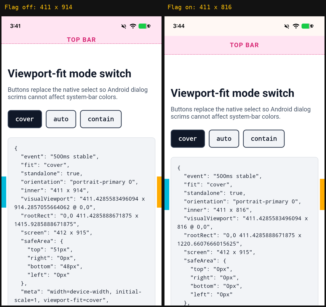
To repeat: install the repro as Fit Switch, set debug_app to the Chromium package, then launch the home-screen shortcut after restarting Chromium with --disable-features=WebAppShortEdgesCutoutMode and again with --enable-features=WebAppShortEdgesCutoutMode. Restore the original command line afterward. This older capture used Chromium 156.0.8067.0; it is not a baseline for the newer build used by the standalone vs fullscreen sampler. Only the fresh-launch cover case was compared here; the dynamic auto/contain matrix was not completed.
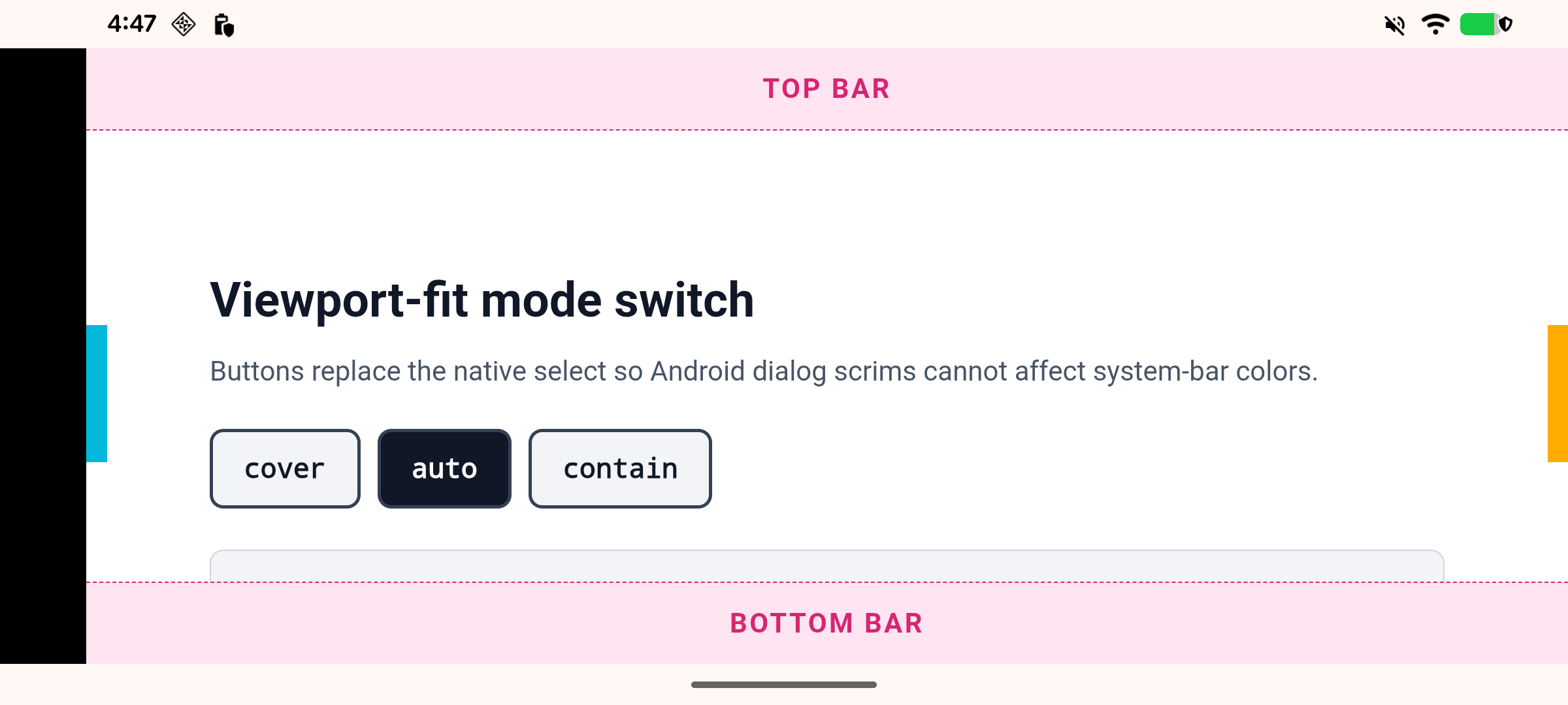
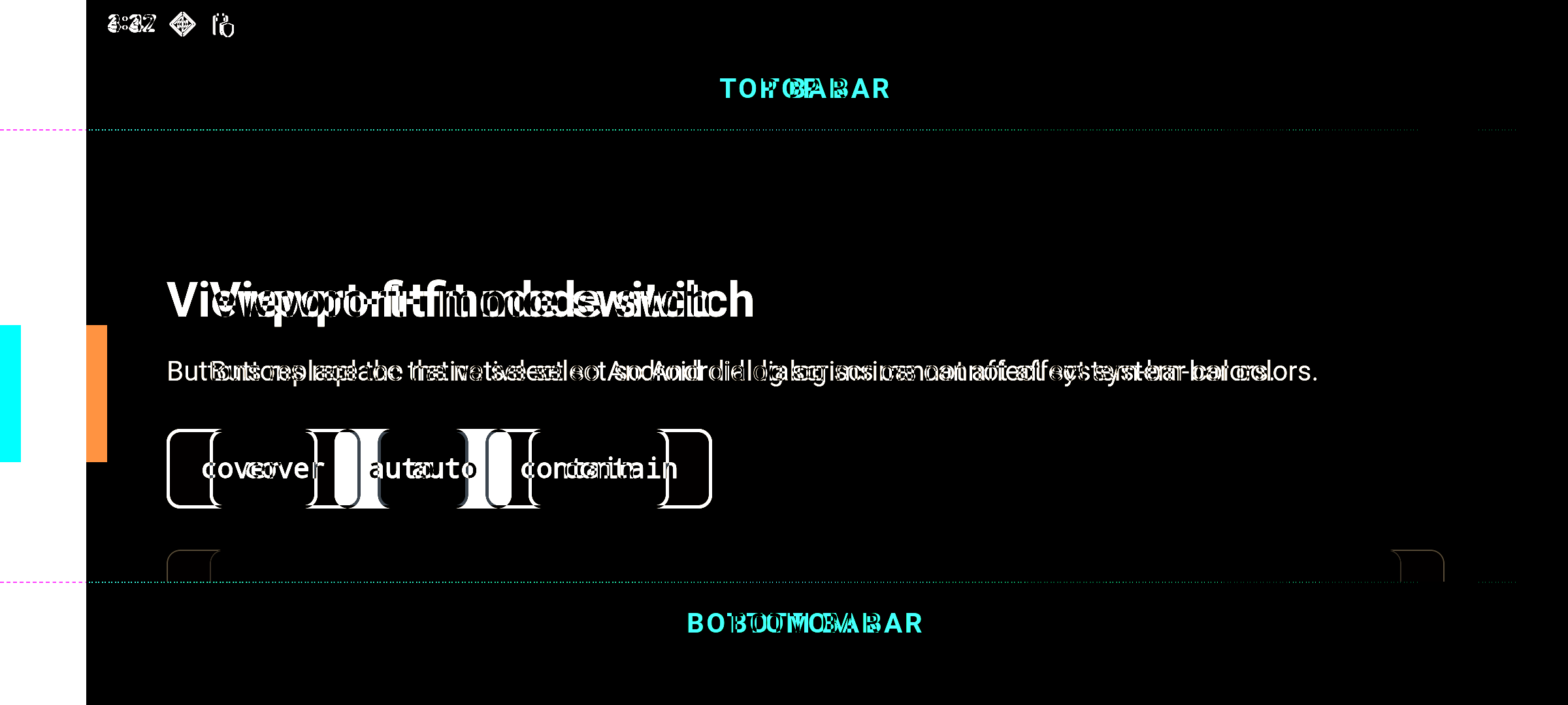
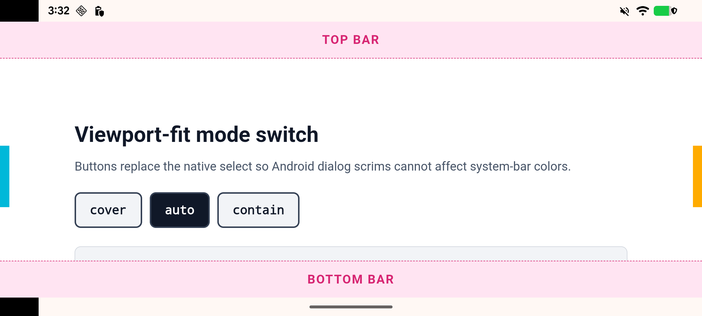
Landscape auto result
Interpretation
- If the artifact remains, it is independent of the original sampler's select dialog and centered card CSS.
- If it disappears, compare the original page's native select, fixed elements, and max-width layout separately.
- The manifest intentionally omits theme and background colors to match the original test site.